docs / user guide
User Guide
A friendly walk-through of the Power BI dashboards, page by page — exactly as shipped to the customer.
Introduction
Welcome. This guide walks you through the DataCycle Domotic Power BI report so you can read every chart confidently and pull the answer you need from your apartment data in under a minute.
By the end of this guide you will know how to:
Roles
The report uses Power BI Row-Level Security with three roles. Admin sees both apartments and is the only role with access to the Compare page. Jeremie and Jimmy each see only their own apartment — the other apartment's data is invisible, not just hidden. The role is set when the report is opened; ask the administrator if you need different access.
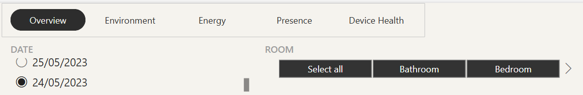
Navigation & Filters
The page menu sits at the top of every page and is your main navigation. Click any tab to switch view:
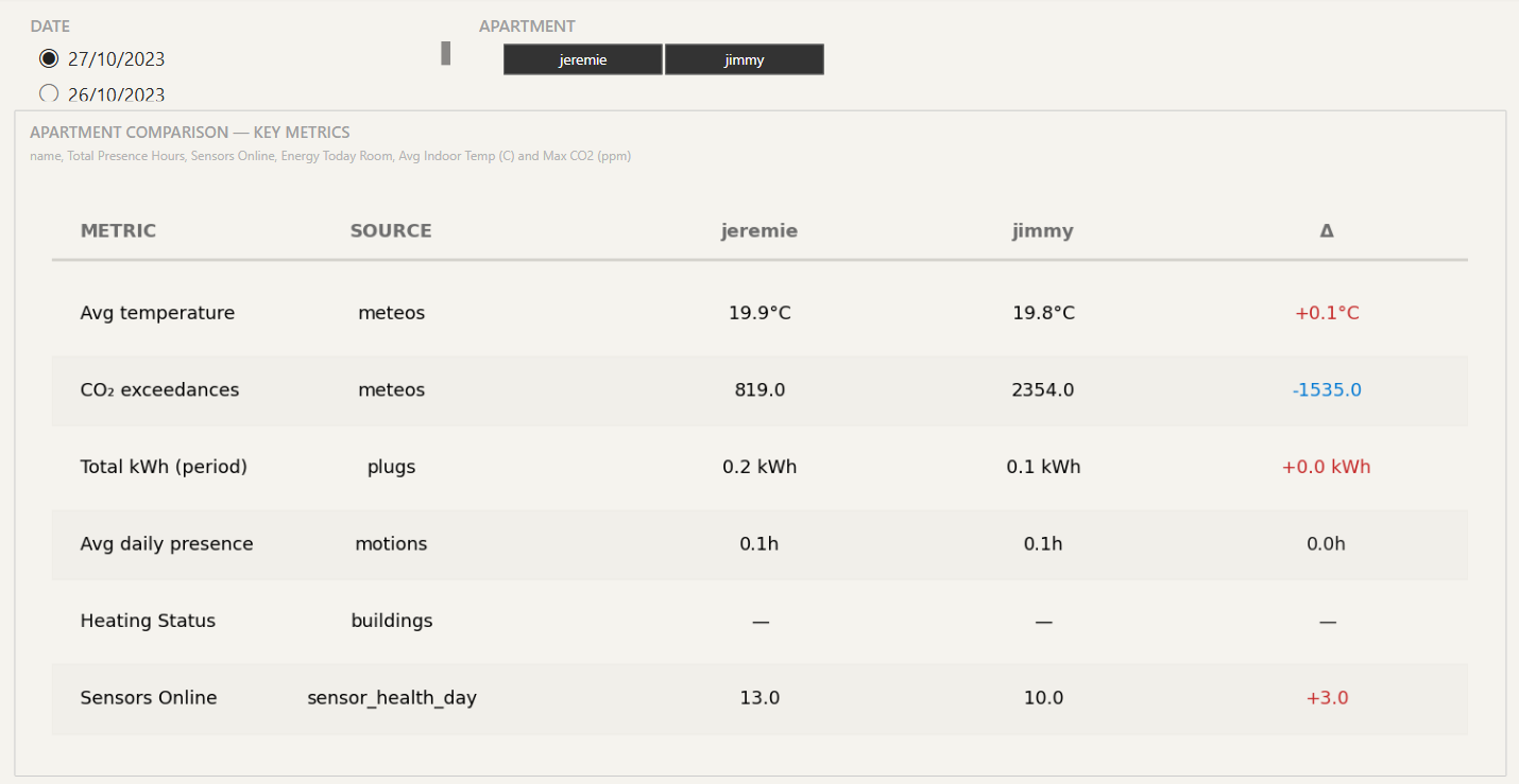
Compare page
Use the Compare page (admin only) to see both apartments’ key metrics side-by-side.
Each row is a metric. The Metric column names what is measured, the Source column shows which gold fact table the value comes from (meteos, plugs, motions, buildings, sensor_health_day), and the Δ column at the right shows how the second apartment compares to the first as a percentage. Green means higher, red means lower.
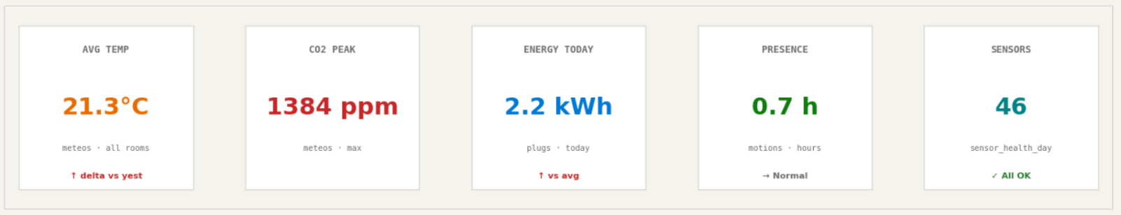
Overview page
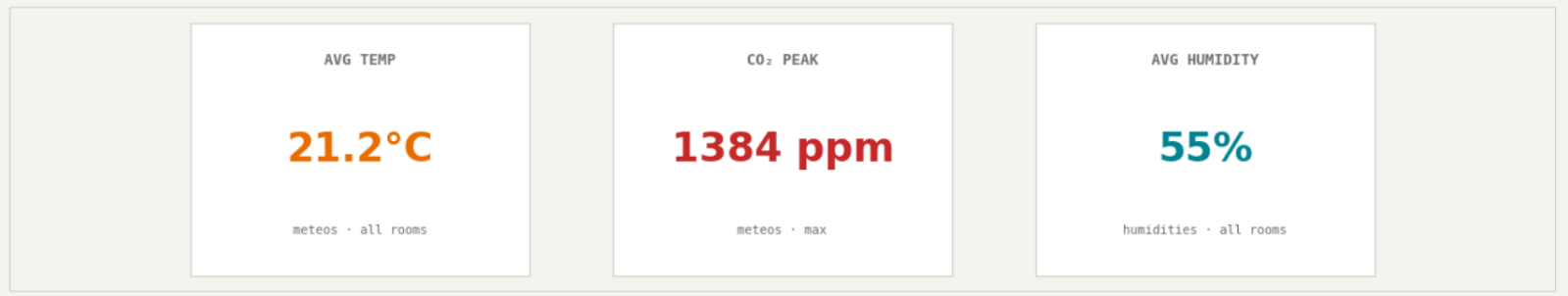
The Overview page is a quick read of everything else. The KPI cards across the top show today’s headline numbers — average temperature, peak CO₂, energy used, presence hours and sensors online. Each card carries a colour-coded trend so you can tell at a glance whether the value is normal, elevated, or concerning.
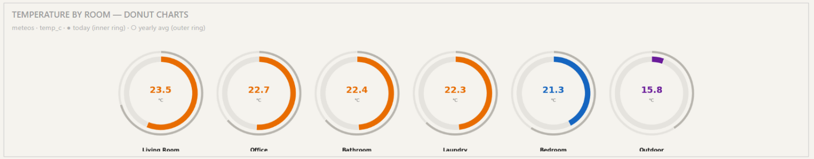
This section shows the temperature in each room. You can adjust the room filter to change what is displayed.
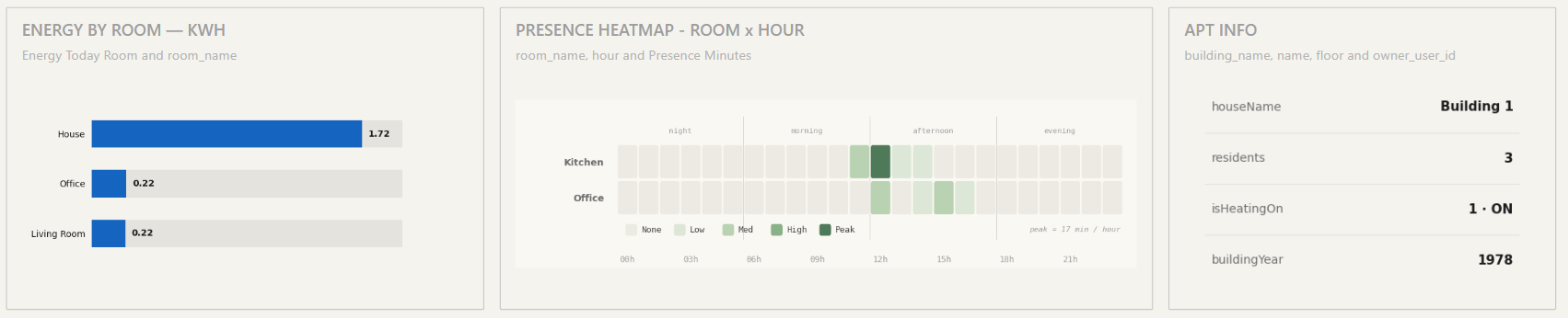
This page includes key graphs from other sections, allowing you to quickly monitor energy and presence at a glance. On the right, you’ll find general information about the apartment.
Environment page
The Environment page covers indoor air quality — temperature, CO₂, and humidity — broken down per room and over time.
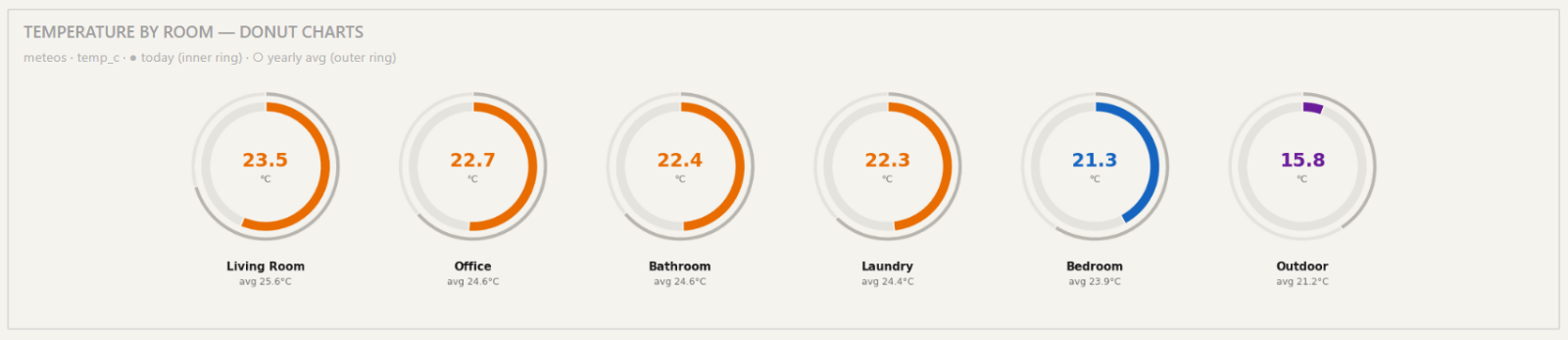
The donut row at the top shows today’s temperature in each room compared to the yearly average, identical to the Overview page.
The Temperature Over Time line chart shows the smoothed daily average across all rooms for the selected period. The grey dashed line is the period-wide average; red dots mark the highest and lowest values; the most recent reading is highlighted on the right.
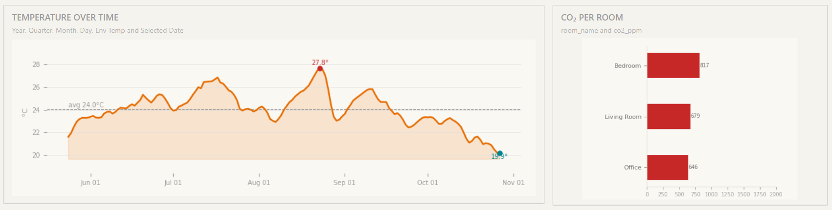
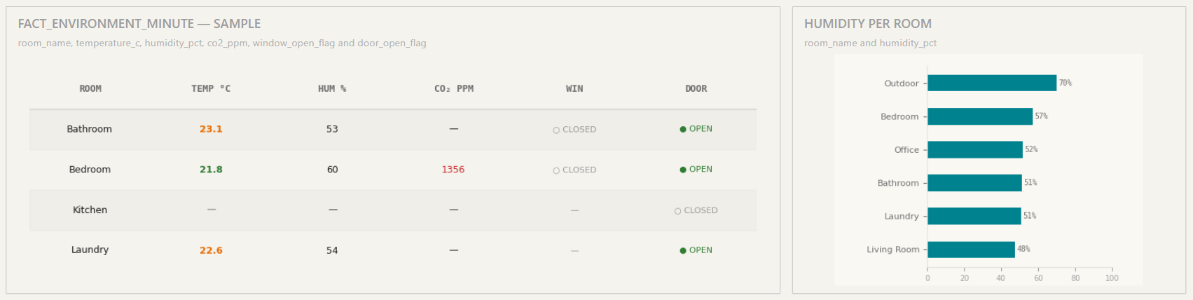
The Fact Environment Minute sample table at the bottom lets you scroll through a one-minute snapshot of every room: temperature, humidity, CO₂, and door/window open state. The CO₂ Per Room and Humidity Per Room bar charts to its right show the worst-case rooms for each metric so you can identify ventilation issues.
Energy page
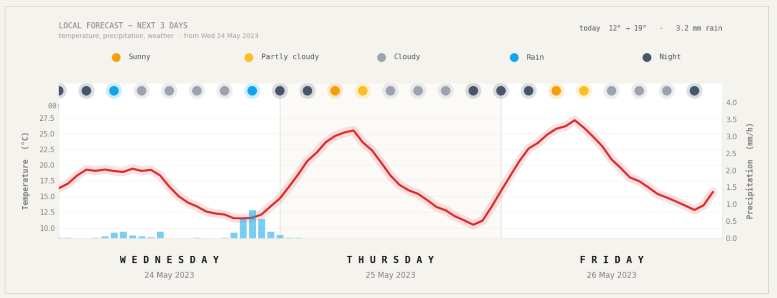
At the top of the page, this graph shows a 3-day temperature forecast starting from today. The red line is the temperature over time. The circle at the top indicates the weather conditions. It also displays rainfall in mm per hour (in blue) when applicable.
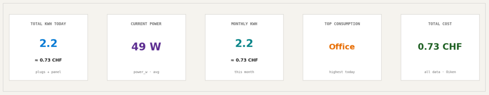
Below the forecast, five KPI cards summarise consumption: Total kWh today, Current Power (W), Monthly kWh, the highest-consuming room, and the Total Cost in CHF (computed from the Oiken Sion 2023–2025 tariff of 0.34 CHF/kWh).
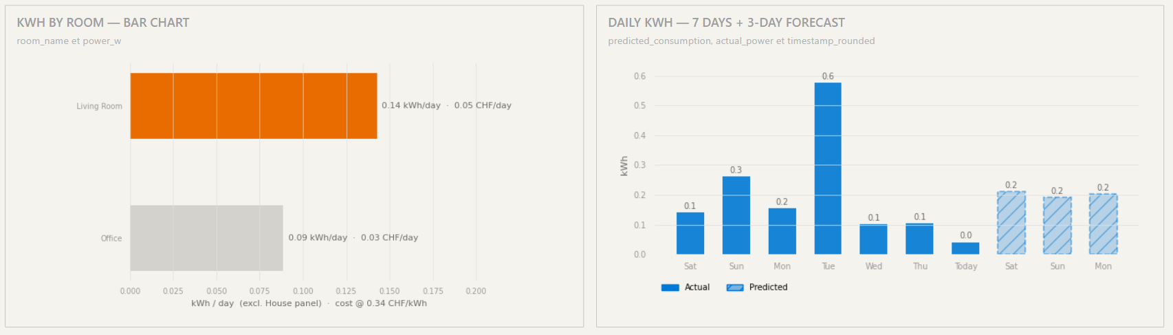
The kWh by Room chart on the left ranks rooms by today’s consumption with the CHF cost on each bar. The Daily kWh chart on the right shows the last 7 days of actual usage plus 3 days of predicted usage from the KNIME consumption model — predictions appear as hatched bars so they’re easy to distinguish from actuals.
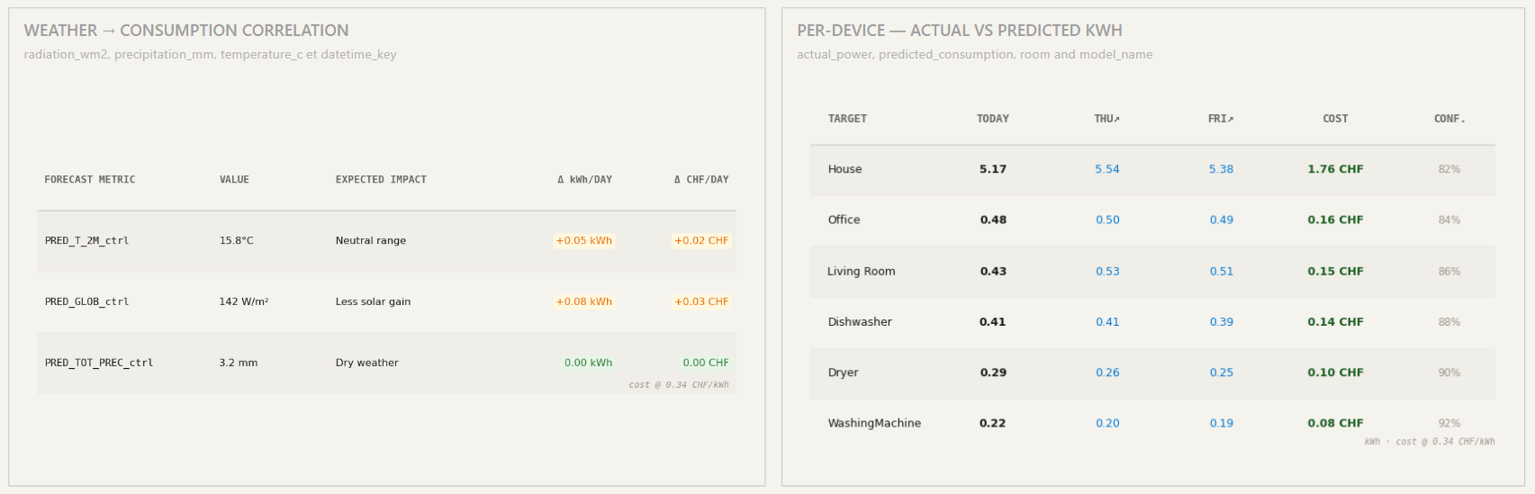
The Weather → Consumption Correlation table at the bottom-left shows how each weather feature (temperature, radiation, precipitation) influences predicted consumption — useful for explaining why the model predicted what it did. The Per-Device table at the bottom-right shows actual vs predicted kWh per device for the next three days, with a confidence percentage.
Presence page
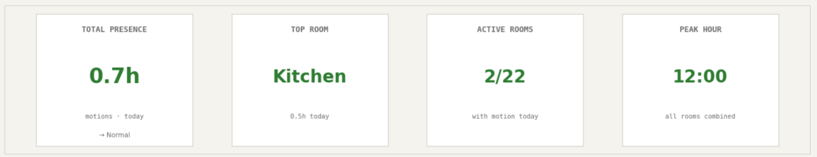
The Presence page tracks room occupancy and motion patterns. KPI cards summarise total presence hours today, the most-used room, the number of active rooms, and the peak occupancy hour.
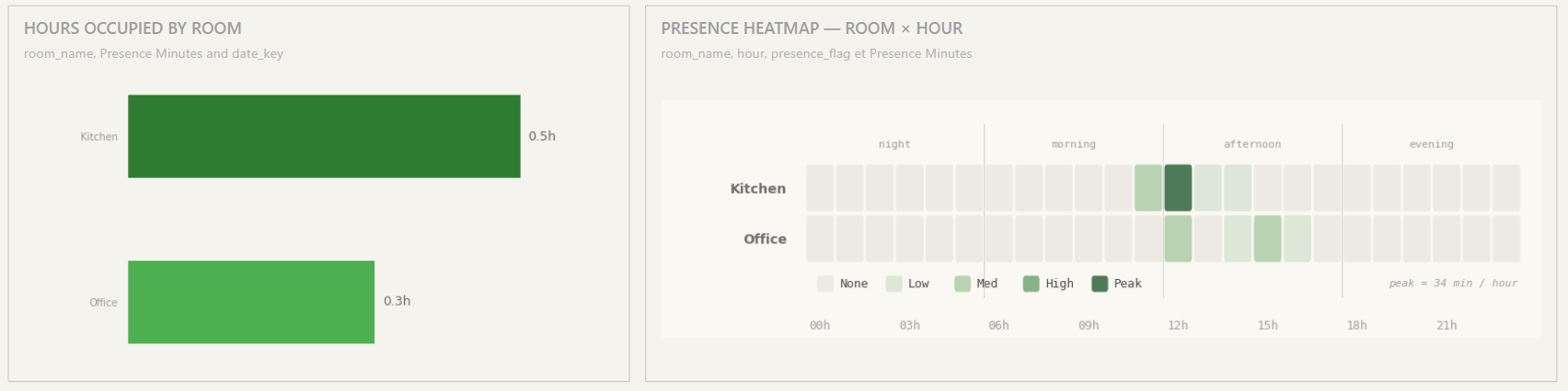
The Hours Occupied by Room bar chart on the left and the Presence Heatmap (Room × Hour) on the right give you the per-room usage profile. The heatmap intensity scales from None to Peak — darkest cells mean longest occupation in that hour.
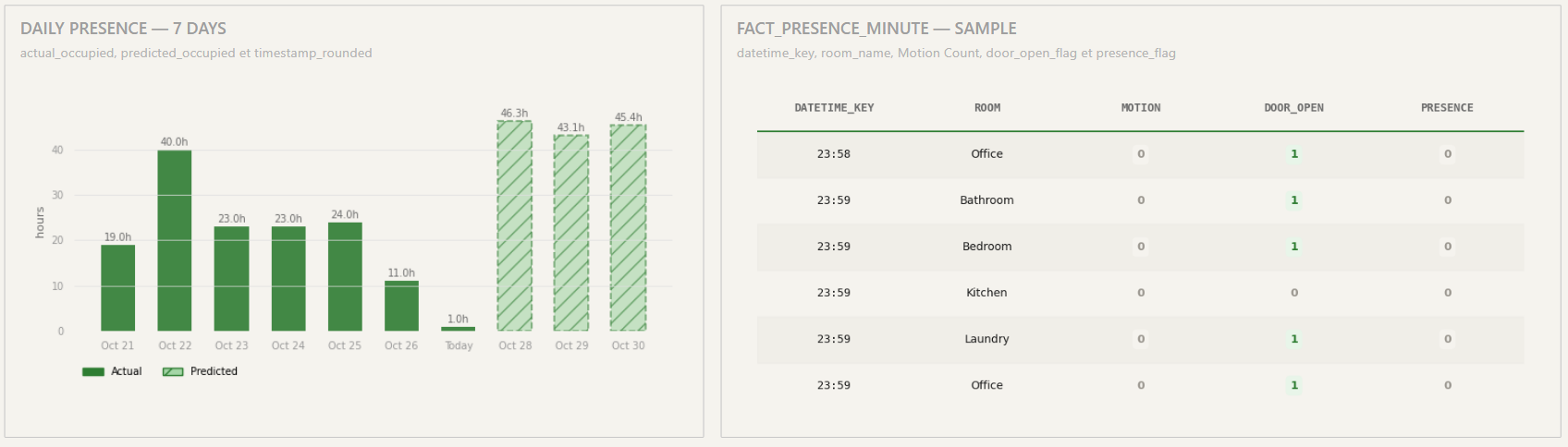
The last section of the page shows the daily presence for seven days. The table breaks this down by motion, door open, presence per room and hour.
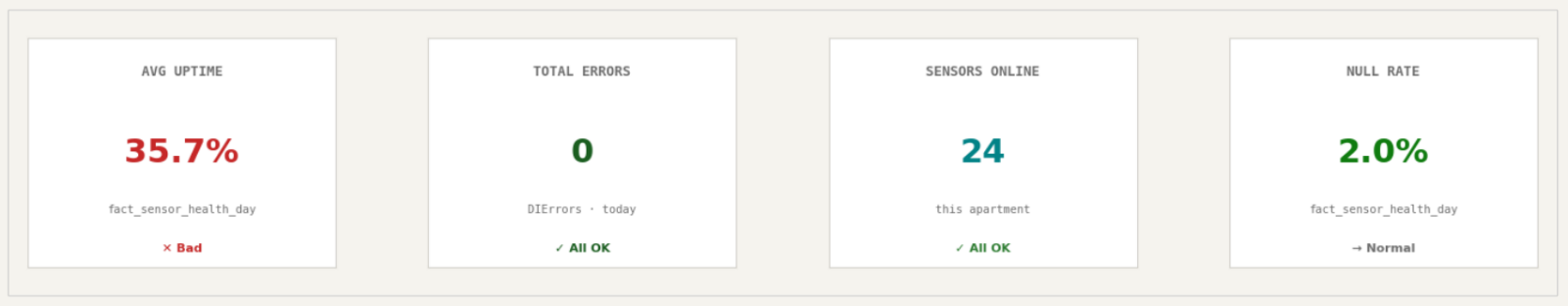
Device health page
The Device Health page tracks sensor reliability. The KPI row shows average uptime, total errors today, sensors online (out of total deployed), and the null-rate (percentage of expected readings that didn’t arrive).
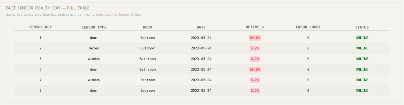
The Fact Sensor Health Day table at the bottom lists every sensor with its type, room, last seen date, uptime percentage, error count, and online/offline status. Filter by room to narrow the view, or sort by uptime to spot problem sensors quickly.
Conclusion
You now know how to read every page of the DataCycle Domotic dashboard, customise filters to match the question you have, and interpret the predictions and weather correlations. The data refreshes automatically — Power BI just needs a manual refresh to show the latest values (see the FAQ).
If you want to understand how the dashboard is built — the gold star schema, the KNIME models, the row-level security implementation — read the companion Technical Documentation.